Flexbox: Simplifying CSS Layouts for Modern Web Design
Introduction
Everything you see on a webpage visually can be arranged into block segments or rectangular containers. Building and creating visually appealing web pages are done with the technique of breaking the webpage into segments to make it easier for you to style your webpage effectively. We use two CSS properties mostly to carry out this function known as Flexbox and Grids systems respectively.
Preview
Understanding the concept of flexbox, its use and applications. Why Flexbox is important to developers and how it makes styling your webpage easier and more beautiful. Understanding its concepts and effective applications on your webpage.
Flexbox
Flexbox is a CSS property that is applied on layouts or containers in a webpage that allows style flexibility and sizing of different elements in a container to fit within the webpage. Flexbox helps you expand or reduce the content of a container and still maintain its relativity. When your browser is shrunk flexbox allows the content of your container to scale their size to that within the browser. It allows you to style the flexibility and sizing of different elements in the container from the actual container selector without ever having to style the flexbox items. We can lay out different flexbox elements across different rows and columns. It allows you to specify how you want your elements or content to grow and shrink in the flexbox.
Below is an example of how to create a flexbox :
<style>
.box{
     display:flex;
     flex-direction:row;
    }
</style>
<div class="container">
<div class="box-1">box1</div>
<div class="box-2">box2</div>
<div class="box-3">box3</div>
</div>
the block code above shows how to create a flexbox. But there are some CSS properties and a few important concepts to take note of when that enhance your understanding of how to effectively use the Flexbox. They are :
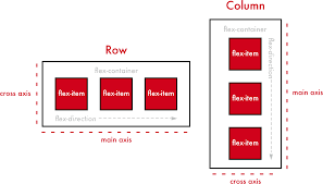
Main axis and cross: the cross axis of the flexbox goes vertically, this is because our default flexbox direction appears in a row. The position of the cross-axis is changed in a column-based layout the cross-axis goes horizontally and the main axis goes vertically.
.box{
display:flex;
flex-direction:row;
};
Above is an illustration of a flexbox with flex-direction set to display 'row'.While set the flex-direction column by simply doing the exact opposite
.box{
display:flex;
flex-direction:column;
}
There we have successfully set the flex direction to appear in a column-based display.
Justify content: this is used specifically to position content in the flexbox container to appear in various arrangments.
 .box{
   display:flex;
   justify-content:centre;
}
From the code block above displayed, we positioned the contents of the flex-box container to its center and there are more position features such as ( justify-content: start), ( justify-content:space-between) and ( justify-content: space ) we can use these CSS properties also for positioning in the flexbox container.
Align-item: this is another flexbox that is also for styling and positioning of contents in a flexbox.
.box{
 display:flex;
 align-item:centre;
}
Flexbox has some flexbox item properties, they are meant to override the position layout properties of the containers such as align-self, flex-shrink and flex-grow.
Flex-shrink: this is a flexbox item property that enables you to specify how you want your flexbox content to shrink or how they scale when the flexbox box container or browser is shrunk. There is an illustration below
.box-1{
 display:flex;
 flex-shrink:30%;
}
Flex-grow: this is a flexbox item property that enables you to specify and determine how you want specific contents of a flexbox container to grow when the size of the browser is increased or the container of the flexbox is stretched. There is an illustration below:
.box-2{
display:flex;
flex-grow:2;
}
Conclusion
Proper acquaintance and effective use of the flexbox and the flexbox give a unique style to your webpage. It makes work easier for you as a developer, understanding the concept of flexbox properties and flexbox item properties prevents you from making technical errors when working